Time Tracker - Updated Navigation
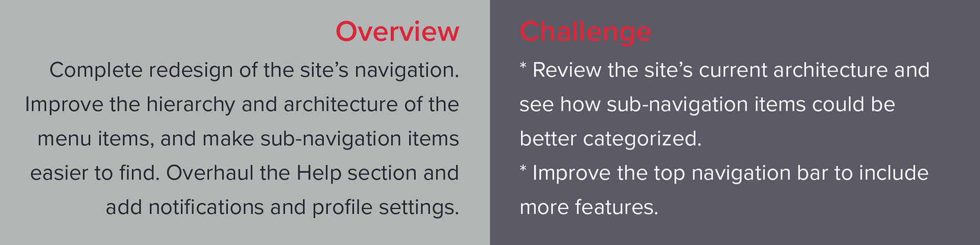
Time Tracker is a program used to track employees' time and expenses. Time entries can be used to invoice a client, or be integrated with payroll software to ensure accurate payments to workers.
As the sole UX/UI Designer for Time Tracker, I was tasked with all research and analysis, UI design, content strategy, and user testing for this project.
Current Navigation
The site's navigation was done by the site's first designer and had never been updated. As new feature were added to the program, they were just placed into the closest matching menu item. By the time I took over, the navigation had become very difficult to use. To go to particular sections, users had to rely on memorizing where things were located.
I started by analyzing the three different navigation segments, starting with the top nav bar. This included the system clock which is a vital part of the program, but it was placed to the side. There was also a language setting dropdown that really didn't deserve such a prominent placement (few people are going to change their language preference more than once!).
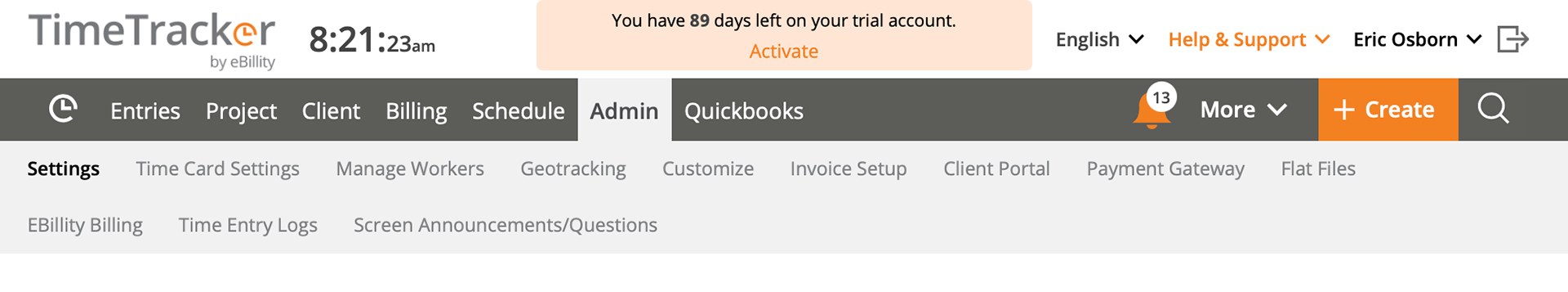
As for the main nav bar (dark gray), the menu items were crowded onto one side of the bar and left-over functions were thrown on the right.
For the sub-navigation (lt gray), this bar would only appear upon hovering over a main menu item. Users would first need to hover over "Billing," then move their mouse to "History" to open that page. Many users had complained that if they weren't quick enough, the sub-menu would close, and they would have to start over. Or, moving their mouse to an item in the top nav bar would inevitably open a flutter of sub-nav items.
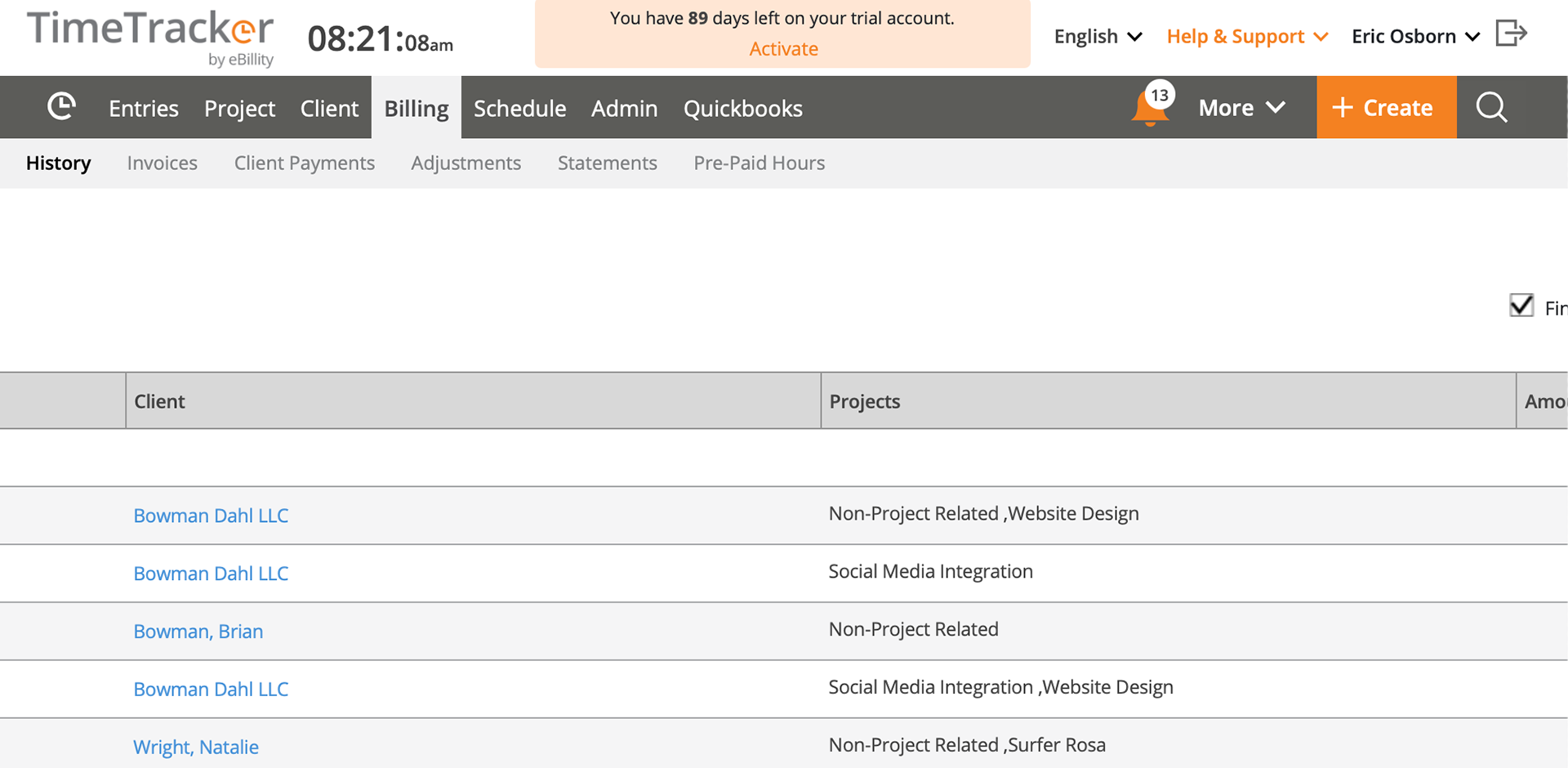
If there were a lot of sub-menu items, the sub-nav bar would extend to 2 rows. With so many menu items, the user spent a lot of time looking for the page they needed.
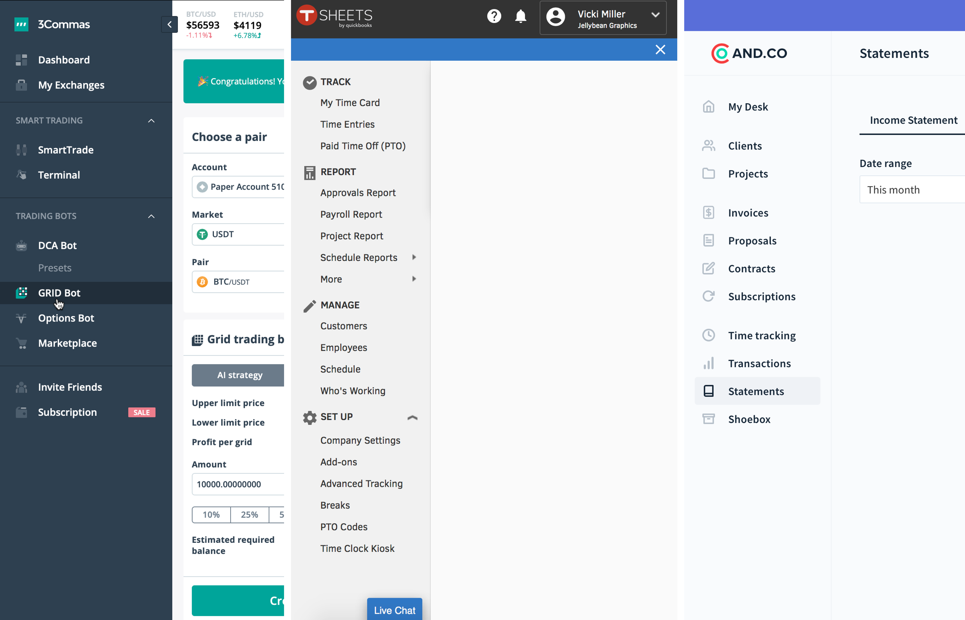
Competitive Analysis
While reviewing some of our competitors, I found most used a side-nav bar. Others had a combo of both side and top nav.
Information Architecture
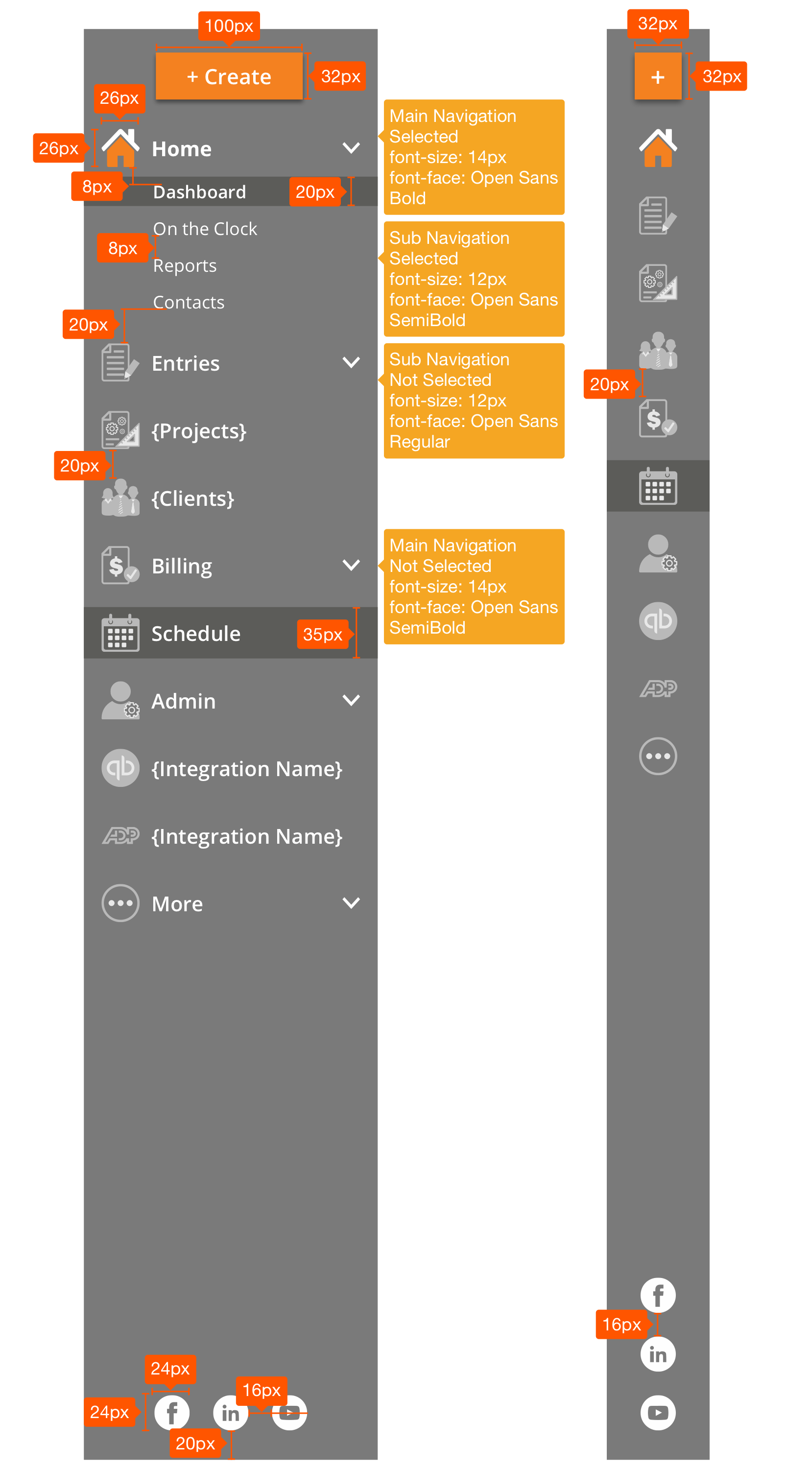
I started by re-working the navigation hierarchy making sure everything was placed under the correct category and also ensuring no single main menu item had too many sub-menu items under it.
Icon Design
I wanted to add icons to all menu items to help the user associate visual images with different categories.
I started with the main menu. The previous navigation had used a clock icon for the home page. While this was a good branding choice for Time Tracker, users did not associate that with the home page. So, I renamed that section "Home" and went with a good old house icon.
There would be a full-color and grayscale version for each icon to indicate "selected" and "not selected."
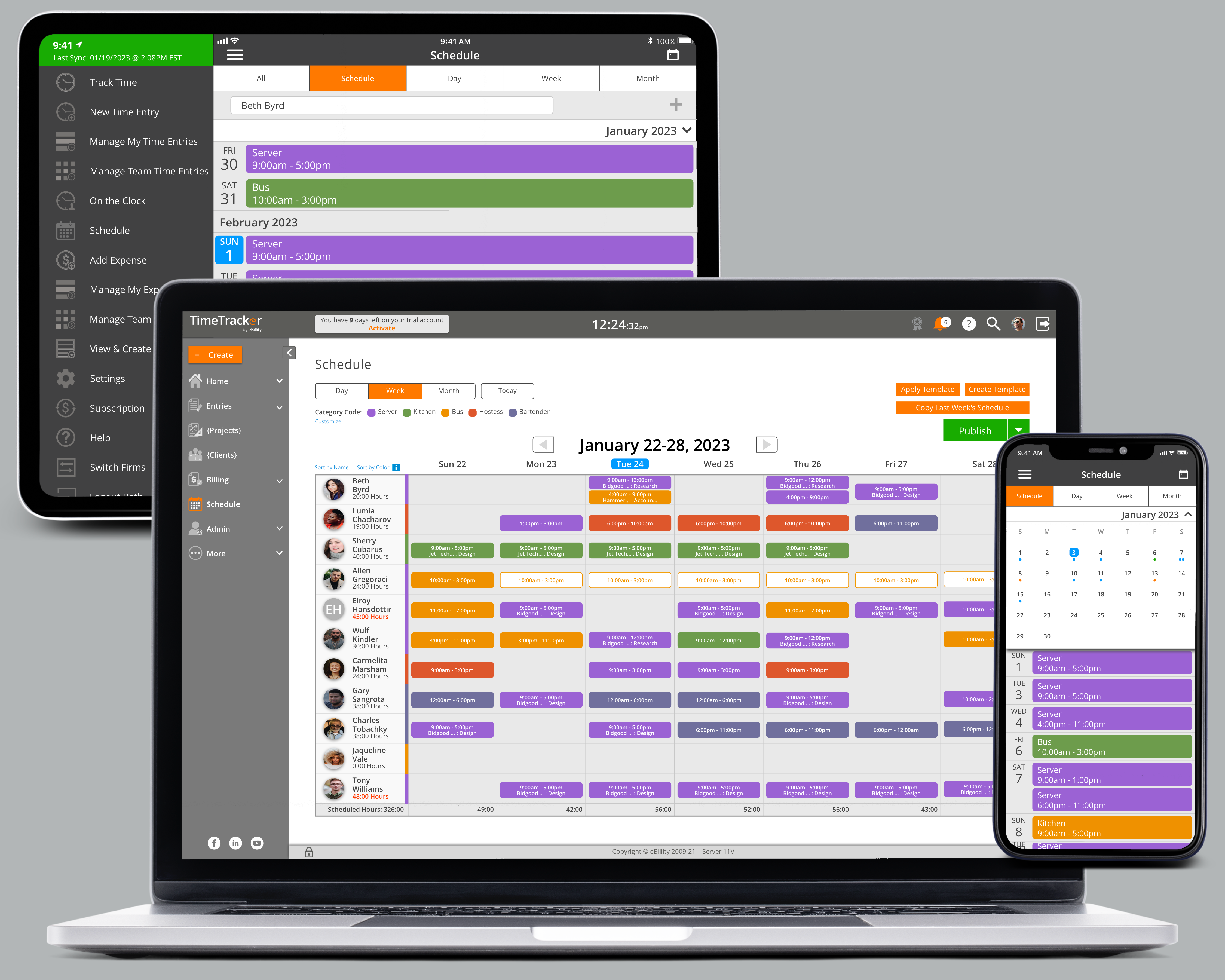
For the side navigation, I moved our "Create" button top the top of this section. The "Create" button is used for quick actions such as creating a time entry or a note on the fly. I wanted to make sure this feature was easily accessed.
To show what section the user was in, the main menu item would be bold and the icon in full-color. The sub-menu item would also be in bold with a dk gray highlight bar.
Since many users worked in several menu sections all the time, while only going into other sections occasionally, I gave users the option of leaving main sections open at all times for even quicker access to the pages they needed. In this example, a user could quickly go from Home > Reports to Entries > Manage My Entries in one click.
For any pages that took up a lot of screen space (or for users who wanted as little "noise" as possible), I made the side navigation bar collapsible.
To make sure padding, fonts, and buttons remained consistent throughout. I handed off annotated sketches to the developers building the navigation.
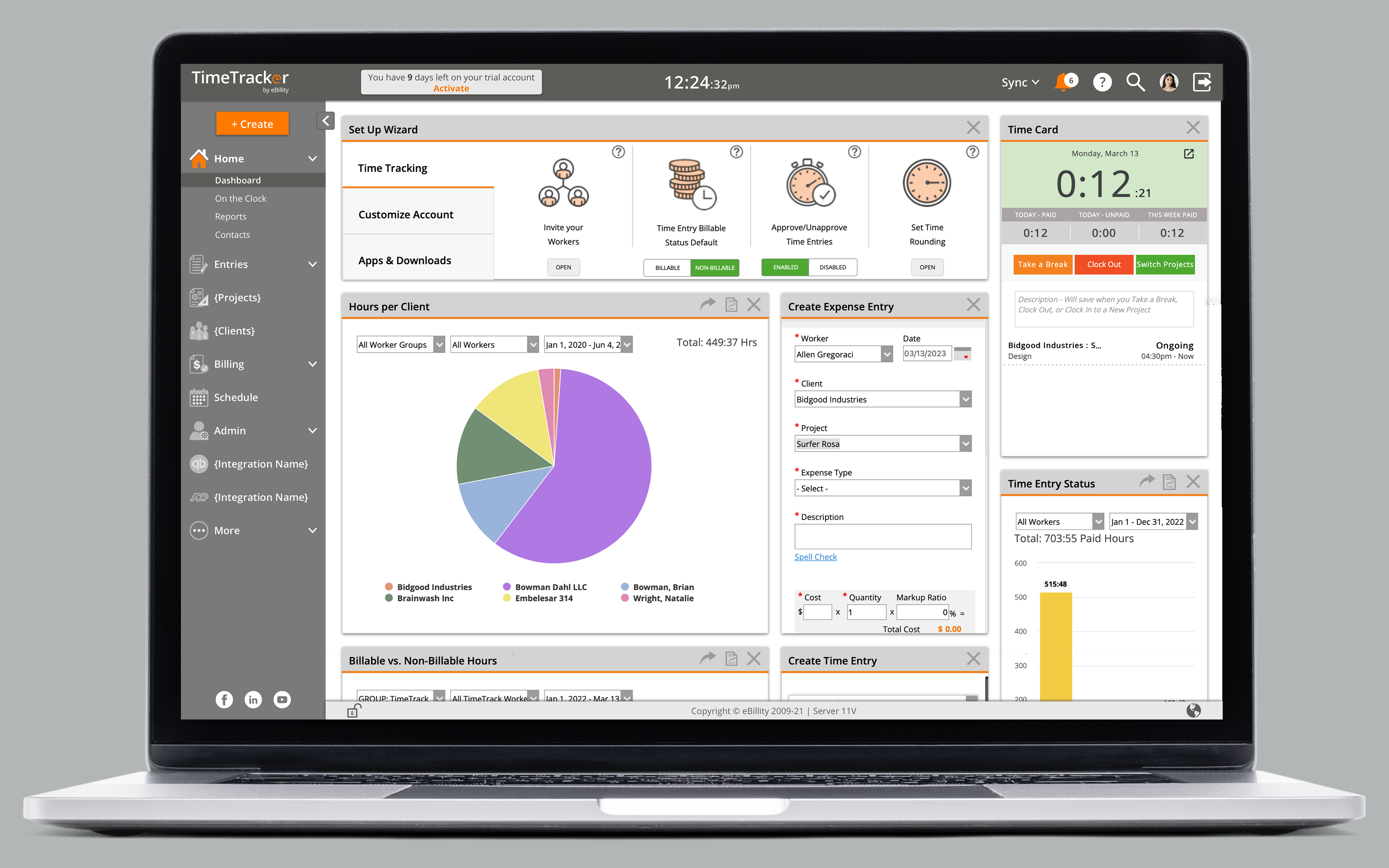
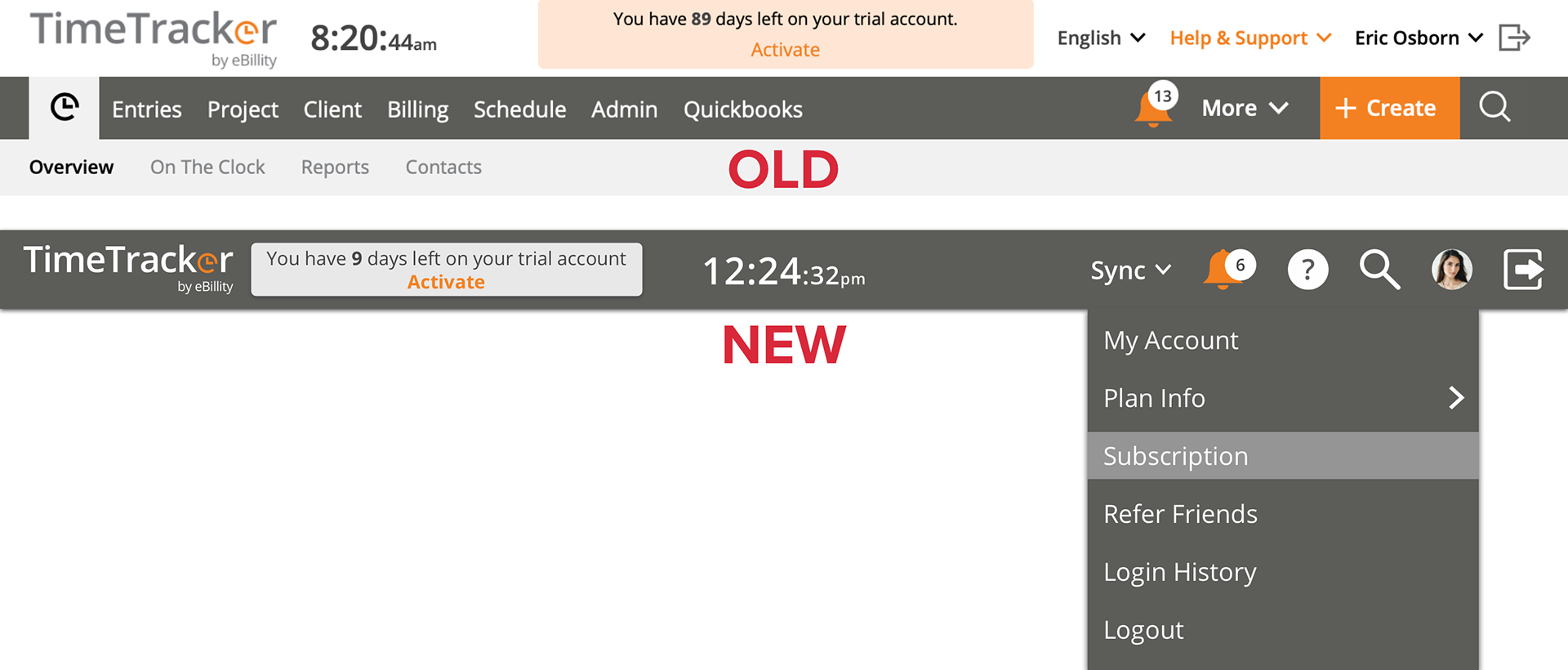
Because the old top nav took up so much room, I wanted to consolidate everything into one bar.
Because we are, at our core, a timekeeping program, I moved the clock to the very center of the bar and repositioned the account activation link.
I completely removed the language preference dropdown. Since this was something that would most likely only be set once, it didn't need to take up so much valuable real estate. This was moved to the footer, and was changed to a "globe" icon.
To fit everything else within one bar, "Help & Support" was changed to a "question mark" icon, and the user's profile name was changed to their photo. The remaining elements were moved to the top bar or became part of the side navigation.
The "Sync" function was previously on its own page, but so many users had requested an easier way to do it since they sync with their accounting integrations several times a day. Adding it to the top nav bar so it could be accessed anywhere in the program was a very popular decision.
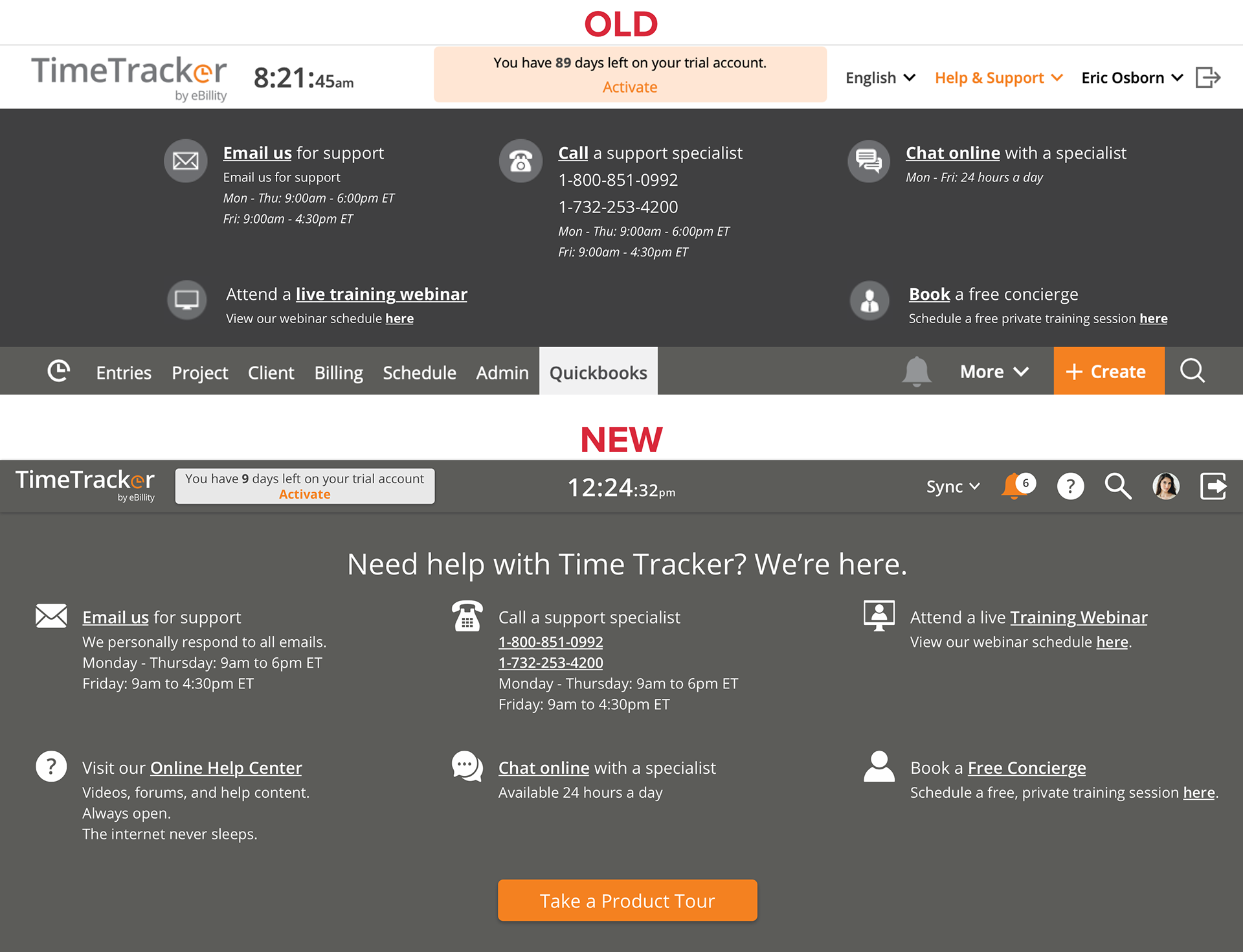
Help & Support Menu
Our support menu was a slide down screen. Due to poor alignment, low quality icons, and minimal directions (and some missing commas!), this page definitely needed a redesign.
I wanted the screen to be more pleasing to look at and allow the user to be able to quickly scan the icons for the contact method they needed. I also wanted to add a link to our Online Help Center which had previously been buried deep within the program.
Sub-Navigation Buttons
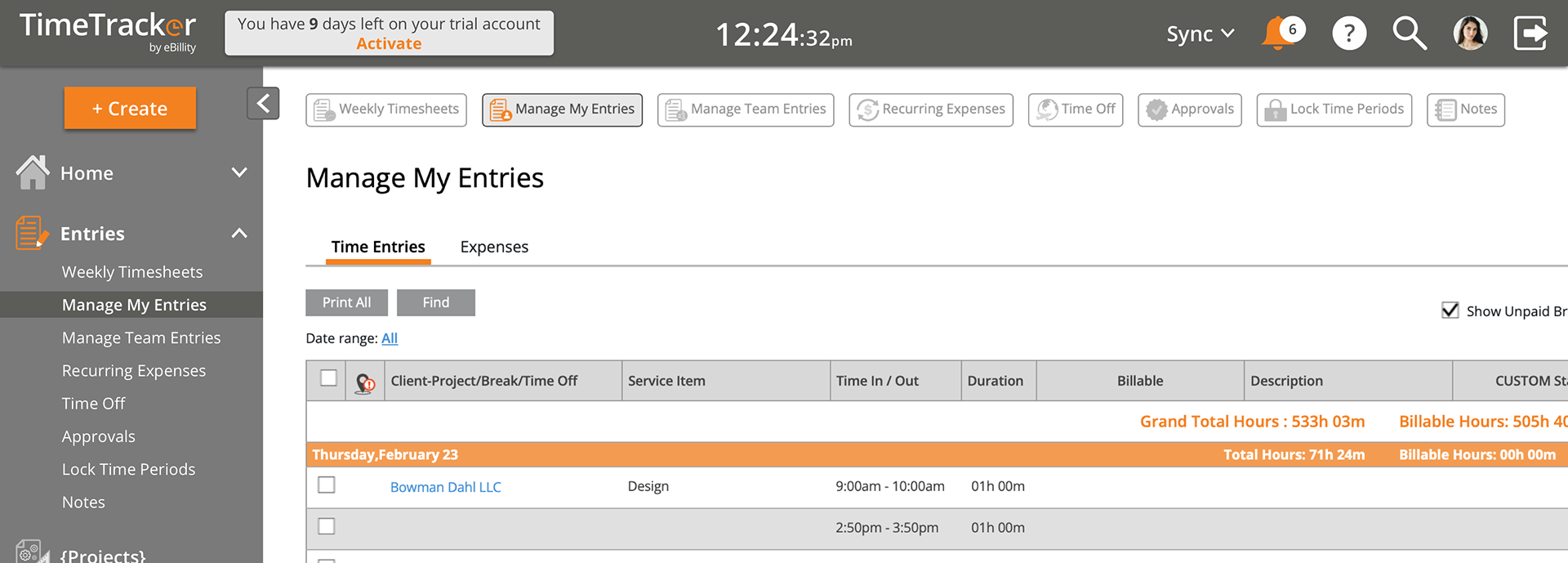
When testing our new navigation, we had a lot of users recommending a breadcrumbs type feature because their eyes often went to the top of the screen when they wanted to go to another page. I felt that might be a bit redundant with the side navigation the way it was, but I did like the idea of users being able to quickly jump to other pages within their current menu section. I added some sub-navigation buttons with icons along the top of the screen, and these proved to be a very welcome addition. Many users commented on how they preferred scanning for icons over readying text.
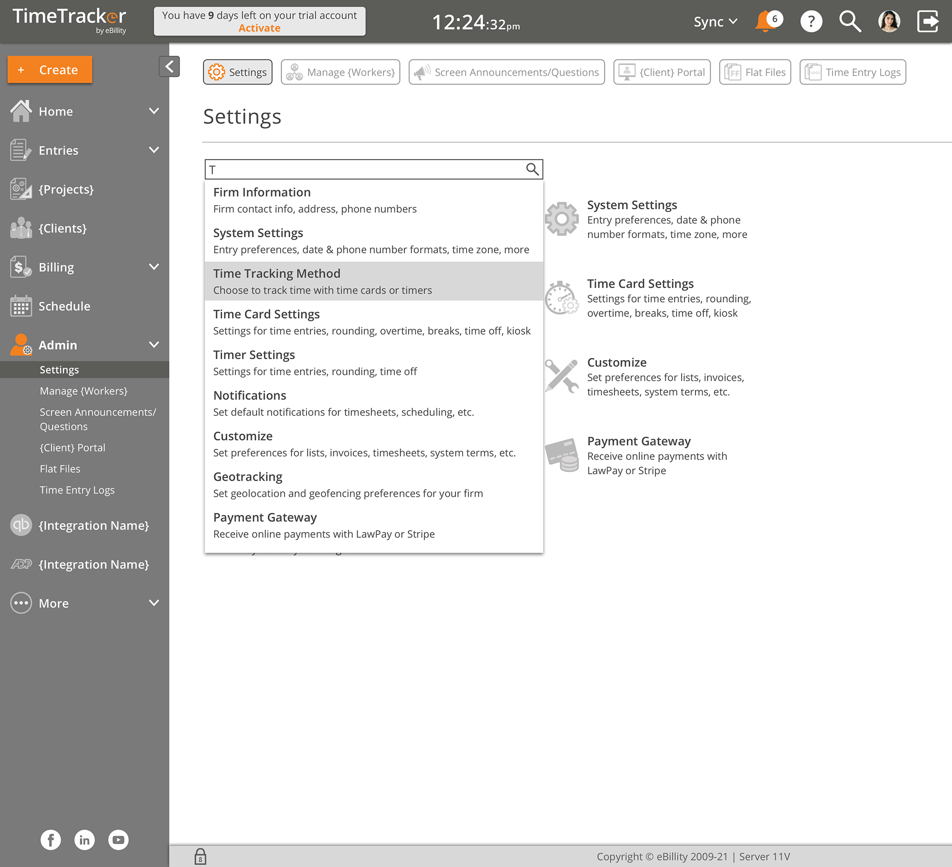
Enhanced Settings Search
With most of Time Tracker's settings being a "set it and forget it" feature, or only being accessed when adding (or removing) a new worker, I wanted to make finding a particular setting easier. Because there were so many pages within the "Settings" sub-menu, I changed the "Settings" landing page to be an index. Users could scan by logo or description to find the setting they were looking for.
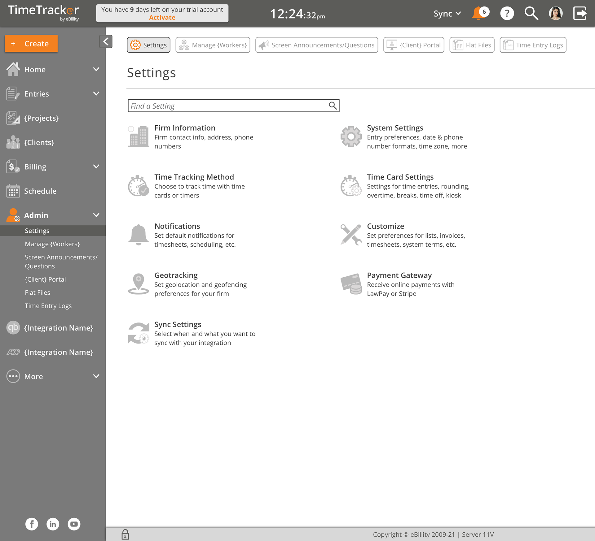
For even more convenience, I added a search bar specific to this page. A user could enter a term (such as "date" or "date format") and receive a list of possible page destinations. Clicking any of those results would take them directly to the necessary page.
After testing with several pilot groups and user types, we finally released the finished version to all of our customers. The new navigation was very well received since it was so much more efficient than before. Users were able to complete their Time Tracker tasks much quicker and move on other work.
One of the things I have learned designing SAAS products is that UI changes can generate many complaints from users. For many who do not consider themselves "techy," they'll learn how to use their work programs because they don't have a choice. But when it comes to learning new ways of using the program to make the process easier, many workers seem to not like change and will resist any updates. This is one of the UI updates that seemed to be embraced by everyone.